A Somewhat Serious Guide to Photography Do’s and Don’ts, Part 1
Golden hour, black and white photography & sexuality.
Welcome to In the Flash, a reader-supported publication about intent and creativity in photography
In last week’s newsletter, I shared how David Lynch and his TV series, Twin Peaks, inspired me to rethink the idea of photography rules. The trick is to have your own guidelines instead of following what the art world tells you. I tried to put aside everything that was fed to me, whether in art school or by the media around me, and devise a personal list of photography Do’s and Don’ts. All of these are subject to continuous change.
PHOTOGRAPHY DO’S AND DON’TS
DON’TS
Golden Hour — Also known as the magic hour, with the magic of turning photos into treacly postcards. In a photo contest I judged last year, 70% of the street photography entries used the golden hour as an aesthetic crutch. It was a dull sea of deep orange.
"Celebrating" as a descriptive term — Celebration fatigue is real. Artist statements and photography reviews overuse the term with the fervor of Socialist Realism propaganda campaigns. It has become a blanket statement to demonstrate morality, justify nudity, and validate mediocre photos. Photography is most powerful when it questions, probes, analyses, investigates, and even offends. Celebrating should be confined to a family album, where it belongs.
Sad young women on beds — That’s a tough one because young women look great sitting forlorn on their beds. Often, there is nowhere to pose the subject other than in their bedroom, especially if it’s a rat-sized NYC studio. As a result, this has become a trope with an illusion of introspection. But if a photographer does need to photograph a woman on her bed, maybe she could at least be smiling?
Cinematic — Accidentally Gregory Crewdson. He spoiled it for everyone with cinematic tableaus that look like orphaned movie stills. Since then, every art student and their grandmother have emulated the aesthetic (me included), by posing unhappy people in dramatic lighting with a hope that it reflects a bigger meaning (it usually doesn’t). Cinematic should be a flavor, not the main course. If all a photo does is look like a still from a film, I just want to see the movie.
Artsy artist statements — Many artist statements exhibit the subtle art of using an overabundance of words to mean absolutely nothing. Dualities are a popular device used to cower the viewer into giving the work significance — space and non-space, the conscious and subconscious, exterior and interior, hyper-reality and non-reality, object and non-object. My mind sinks into both stupor and non-stupor as it struggles to decipher and un-decipher the meaning and non-meaning of such artspeak.
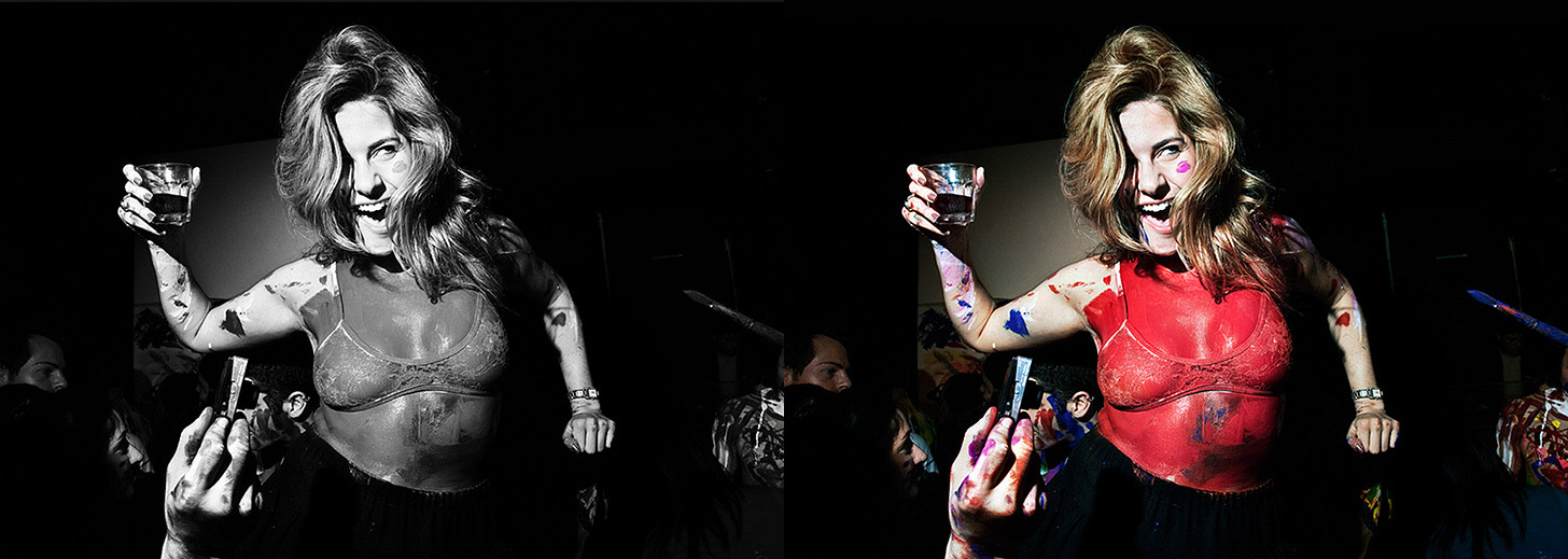
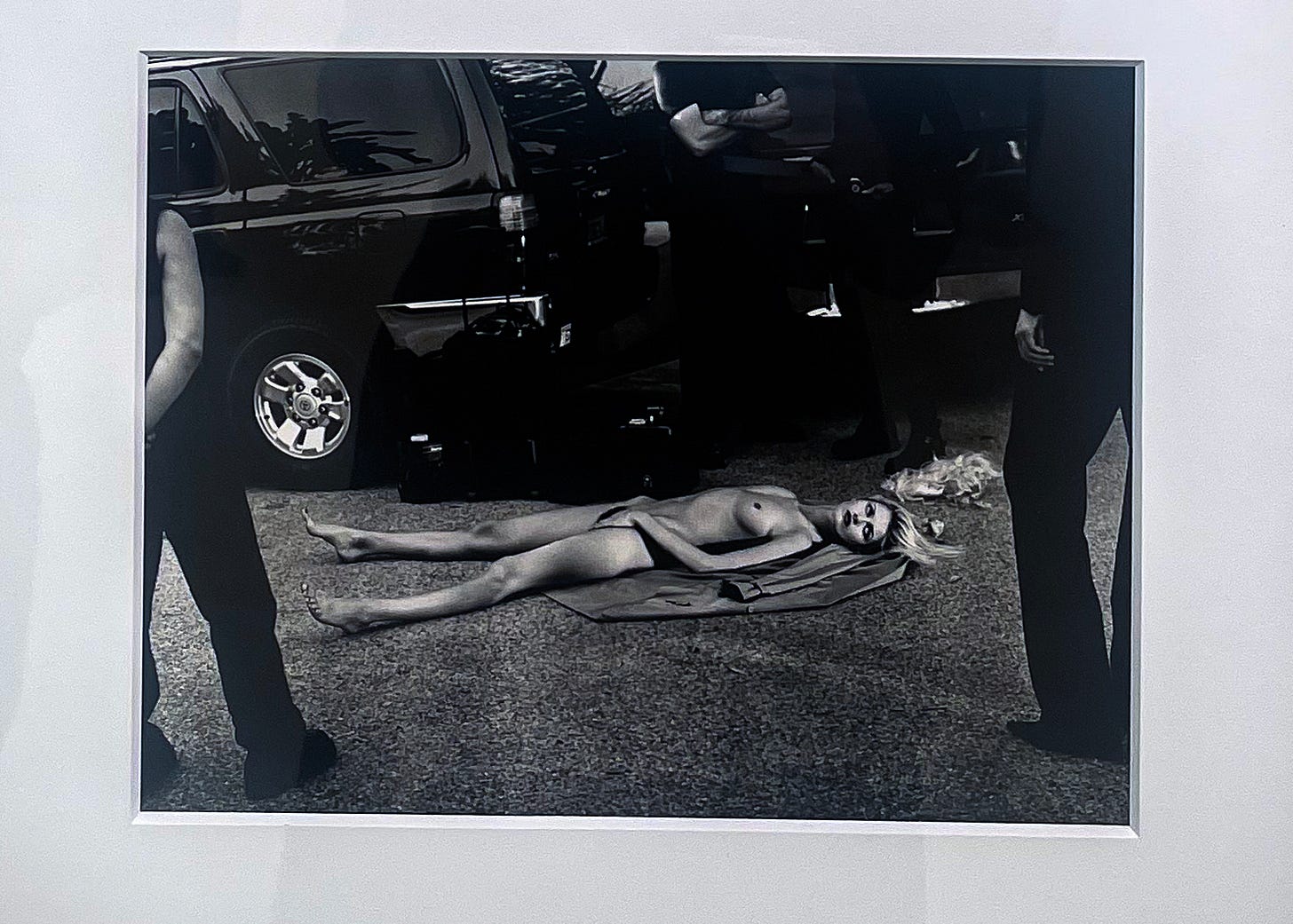
B&W photography — B&W will not make photos “artistic, classic, or timeless.” That’s a misconception derived from venerating classic photography books. Photos that aspire to be nostalgic from the get-go will age badly. It makes no sense that the current moment is made to look like the same historic image we are so giddy to colorize. There are a handful of contemporary photographers who use B&W brilliantly (Philip Montgomery, Matt Black, Paolo Pellegrin, to name a few). For the rest of us, proceed with extreme caution.
Comparing photos to paintings – Comparing photography to another art form is a backhanded compliment. The blame is not on the viewer. Photographers do it to themselves, using the 16th century lighting of Rembrandt or Caravaggio as a saving grace to an otherwise boring portrait. Being influenced by an art style is great, imitating it is not. I don’t want to see another photograph paying homage to the Old Masters ever again.
Sentimental photo titles — A photographic equivalent of gastronomy foam. No dish is made better because of it, and no photograph can be improved by a platitude. It forces a photographer’s emotional state on the viewer and closes the image to interpretation. Many good photos are irrevocably ruined by titles drowning in sentiment. The courage to let your photos breathe and be experienced differently than intended is essential.
DO’S
Cropping – There is a purist school of thought that not cropping your images is a mark of a better photographer. I find that mentality to be lazy. Cropping in post relies on intent, which takes effort and time. But it’s worth it. An incredible number of photos can be improved by experimenting with the right crop.
Sexuality – Nudity doesn’t have to distance itself from sexuality at all times. The female gaze is a powerful and much needed addition to centuries of male indulgence at the expense of the female body. But sometimes, I miss the male gaze. Especially when it’s a gaze like Helmut Newton's, Guy Bourdin's, or Robert Mapplethorpe’s. I want more sexuality in photos that are messy, dirty, and dripping with desire, regardless of the photographer’s gender.
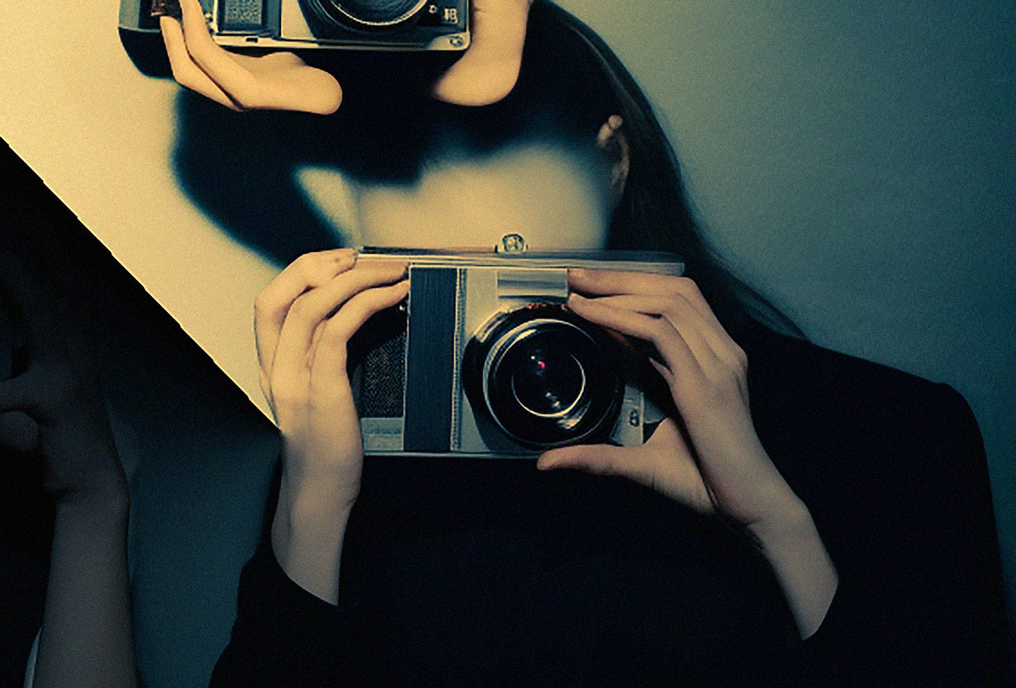
AI — Ethical discussions and copyright questions are vital when discussing AI, but vilifying and boycotting the technlogy is not my preference. Misconceptions beget fear, and many of the most vocal AI critics have never used it, so I spent a couple of weeks playing with Midjourney. It was both a fascinating and irritating experience but one that I recommend.
Train your gaze – One time I was so intently focused on photographing a couple kissing on a bench, that I didn’t notice a burning trashcan just a bit to their side. I missed the shot completely, the trashcan being too blurry to have a play in the composition, and it’s the one shot I want to go back and redo. Since then, I’ve learned to scan the environment, in rows from left to right, then up and down, to make sure this never happens again. I note the quality of light, the colors around me, and every detail of my surroundings. Burning trashcan, I am ready for you.
Use filters — Find filters that make you uncomfortable and play. Investigating what a photo will look like with a dollop of art sauce on top can open a door to new ways of seeing.
Steal from other arts — Emulating other photographers results in imitation. But taking ideas from other art forms, whether music or painting, subjects them to enough metamorphoses for a unique POV. If I were a band, I’d be the Avalanches, an Australian group which sifts through thousands of old records, gathering fragments that are then combined into a brilliant musical tapestry. The more different sources you steal from, the more original and personal the work becomes.
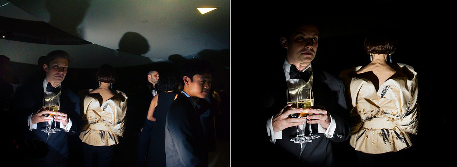
Artificial light — Edward Hopper loved artificial light. His paintings romanticize the lightbulb, using it as the sole source of illumination. Being able to harness alternative sources of light, from off-camera flash to household lamps to a flashlight, is a superpower. There is never a need to wait for the light to change or be limited to posing the subject in that last splash of afternoon sun. Inspired by Hopper, I have learned to construct a lighting setup with any sources of light that are present on the scene, whether in person or remotely. I would say that this has made my career.
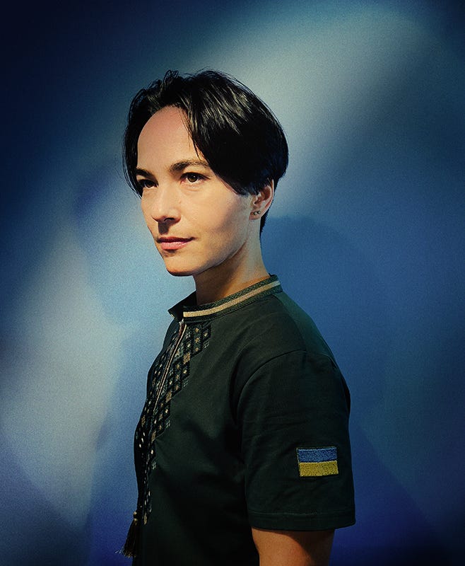
Discard labels — What is a fine-art photographer? How is it different from documentary or editorial? How fine is the art anyway? Non-photographers are as confused about labels as we are. David Lynch did it the right way. His show, Twin Peaks, is hard to pin down, as it snakes through every conceivable genre, from horror to slapstick comedy, often in a single episode. For my work, I am most interested in the blurry line where reality transforms into a fictional world that is based in fact but owes it no allegiance. I never found a good label for it.
Find me on Instagram
Find me on TikTok




I was seriously laughing out loud at the Artsy Artist Statements one - I thoroughly appreciate your insights but I LOVE your writing, cheers!
This is great! The way I internalize it is that we love to consume contrast of all kinds. Perhaps the m most delicious one is the contrast between the actual image/story and one’s memories/expectations about the subject(s)/story(ies) in the image. That makes clichés super boring. Loved the writing! 🍷